Monday 28 November 2016

Google Hangout post for 29th Nov

This work is for assignment 2 of BoW and is currently still a work in progress. Any thoughts on the project would be appreciated.


A still image of the body print composition for the bottom of the inclined base:

An excerpt from the book "The Men with the Pink Triangle" that may accompany this piece of work to help anchor its meaning and give some context:


Update:

This proved to be a very useful session with the other OCA participants. The feedback on my proposed structure was that the concept was good but the visual presentation still needed refining. The overall consensus was that the mine cart structure that sits on top of the inclined base was an unnecessary element. Stan thought it looked somewhat toy-like which was representative of the overall piece because of its tabletop scale. I would like to make this structure life size (although probably not a task I would be able to tackle for practical reasons). Stephanie and John thought the piece would be stronger without the mine cart. Stephanie made a very good point, that I am voicing the same message three times over with this piece; the text caption, the bodyprint, and the mine cart, all say the same thing. When this was pointed out I could immediately see that the viewer's eye flicks back and forth between the mine cart and bodyprint image - they compete with each other. The bodyprint element becomes stronger on its own and the message remains the same.

I am coming around to the idea of using just the base and bodyprint... Although I love my mine cart! What is that Stephen King comment on improving your writing? That a writer needs to "kill your darlings". I can feel the pain...

Comments were also made about choice of colour. What message was the colour tone of the bodyprint sending. John called the print 'alluring' and I've had some Facebook comments about it being beautiful. We had a useful discussion about the nature of the aesthetics of an artwork and how to hook an audience with its aesthetic appeal regardless of the seriousness of the message.

My choice of using fabric to cover the base was also commented on. John commented that the structure looked 'shroud like' and similarities to the bodyprint on fabric reminding him of the Turin shroud. I've made this connection too - not sure what to make of these thoughts at the moment. To be honest I'm not totally sold on the use of fabric either. I'm still thinking about it...

Some useful references:

Primo Levi - If This is a Man
Zadie Smith - On beauty
Steffi Klenz
Pauline Boudry/Renate Lorenz - N.O. Body

Poly Vinyl - may be useful as an alternative to my fabric printing choices.


Thursday 3 November 2016

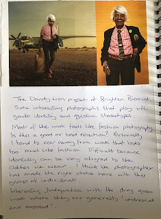
Brighton Photo Biennial 2016 - The Dandy Lion Project

These exhibits were part of Brighton Photo Biennial 2016. We visited both venues as an organised group of OCA students and it was interesting to hear and discuss other people's viewpoints on the work.

The Dandy Lion Project

This work uses the convention of advertising and fashion photography to:

'highlight young men in cityscapes, defying stereotypical and monolithic understandings of black male identity, by adopting Edwardian-era fashion and fusing this with traditional African sartorial sensibilities.'

I had difficulty reading this work. I'll openly admit that I have a bias against fashion photography - apart from making people, clothes, and objects look cool what is the point; it's just designed to sell stuff; and even though, as the tutor Clive White pointed out, the work is subverting the genre of fashion to communicate the message of stereotyping and identity, I can't get past the fancy clothes and shoes.

Of course the colourful clothes are kind of the point of the work. They are used to create a sense of identity in order for 'tribes' to communicate their status to others. We see this all the time with teenagers, followers of particular designer brands, or members of a golf club. So in retrospect now that I've had time to think about the work I can appreciate the intent - but the visual aspect of the work itself - not so much.

One aspect of the work I also take issue with is in the curator's statement that the images challenged the traditional notion of maleness. I totally disagree with this statement. The clothes are heavily masculine in their characteristics. The men mostly wear suits, with traditional waistcoats and leather shoes. The colours and patterns are bold but the look of the clothes could not in any way represent an androgynous outlook. I think the work helps to challenge Black stereotypes but the work and the wearers of the clothes are thoroughly embedded in the gender stereotype box.

The Dandy Lion Project


Wednesday 2 November 2016

Brighton Photo Biennial 2016 - Reimagine

The theme for the 2016 Brighton photo biennial deals with identity by looking at the representation of minorities and urban sub cultures through the lens of photography:

"Beyond the Bias – Reshaping Image, explores photography’s role in defining and informing our understanding of subjects such as: gender and sexuality, the representation of the body, the politics of style, subcultures and the subversion of social and cultural norms."


Reimagine

I attended as part of the OCA study group weekend and we began our trip by looking at 'Reimagine' a collaborative exhibition between two photographers, Bharat Sikka and Olivia Arthur. The project photographed LGBTQ+ people in Mumbai, India and Brighton, UK. The work shown was made on large format film, using mainly B&W for India and colour for Brighton. On a first walk through I noticed that the work appeared to be separated by photographer and that made me wonder how much collaboration had taken place.

The content of the India work appeared more somber. This is due to the nature of the subject, where LGBTQ is still a highly political issue in that country. The choice of B&W also influenced my reading of the work. I was struck by an image where a couple (men?) appeared to be embracing on a beach in the shadows at night. The figures were distant and blurred, and there was a sense of danger because of the vulnerability of being exposed in a public place but also trapped because there was no private place to go. The portraits were more relaxed and taken inside and being in a private space, contrasted well with the public space images. My reading of the images were confirmed by the statement in the artist's handout:

"When I started making work in Mumbai I focused on private spaces. In their own space a sitter can be comfortable, really be themselves. People were being open about themselves and their sexuality beyond what I had been expecting, or hoping for. But I began to realise the context was missing for the project, that I needed something to show the sitter's boldness and the cultural background they were willing to show their image in... [...] Down by the beach, on the steps by the waterfront, even on the hard shoulder alongside the freeway, couples would try to find some privacy in a dark, but very public space."  

The Brighton work appeared more relaxed and celebratory and had an element of fantasy and creativeness - mainly because the sitters were in the process of exploring themselves through clothes and body image. One of the standout portraits for me was of 'Loki". A bare chested man wearing a taffeta tutu is leaning out of a window. The room is in shadow and his body is half exposed by the sunlight. The metaphor in this image for me was all about the contrast between the projected and public face of masculinity (the bare and muscular chest juxtaposed by the lower body wearing a tutu in half shadow) and exploring a more feminine identity that needs to be kept private and suppressed - for the majority of males.

Loki "I grew up on a rough council estate. When I moved to Brighton I felt I was comfortable in a community that would accept a six-foot skinhead that could wear a taffeta tutu."